🏃 Ultra-Marathon Race Analysis – Exploring Gender, Age & Seasonal Trends
For this project, I analyzed a massive real-world dataset of ultra-marathon races as part of a self-directed learning goal to improve my data analysis and storytelling skills using Python. The dataset, sourced from Kaggle, contains over 7 million race records spanning two centuries, offering rich insights into human endurance and athletic performance.
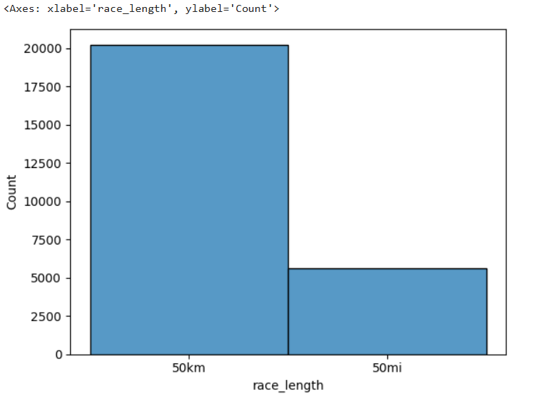
To keep the analysis focused and manageable, I worked with a subset of the data — specifically 50K and 50Mi races held in the USA during 2020.
🔍 Project Goals
My main goal was to turn messy, real-world data into clear insights through thoughtful cleaning, analysis, and visualization. Along the way, I challenged myself with the following questions:
Do male and female athletes perform differently in ultra races?
Which age groups tend to perform best — or worst — in 50-mile events?
Does the time of year (season) impact how fast people run these races?
🧼 Cleaning & Preparing the Data
The raw data required substantial cleaning. I:
Filtered for U.S. races in 2020 at distances of exactly 50 kilometers or 50 miles
Cleaned up inconsistent text data (e.g., race names, performance times)
Removed irrelevant or redundant columns
Converted time and speed values into usable numeric formats
Engineered new features like season, derived from race dates
This gave me a clean dataset with well-structured fields like:
Athlete age
Gender
Average speed (km/h)
Race length (50K vs 50Mi)
Season (Winter, Spring, Summer, Fall)
📊 Visual Storytelling
Using Seaborn and Matplotlib, I explored the relationships between gender, age, and seasonal performance.
📍 Key Insights:
Speed by Gender:
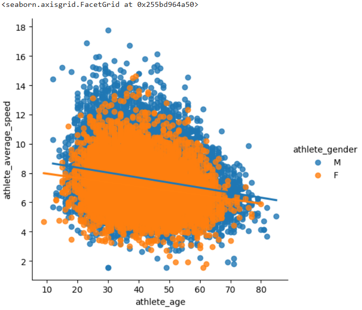
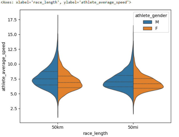
Male runners had slightly higher average speeds in both 50K and 50Mi races, but the difference was not as large as commonly assumed.Age Group Performance:
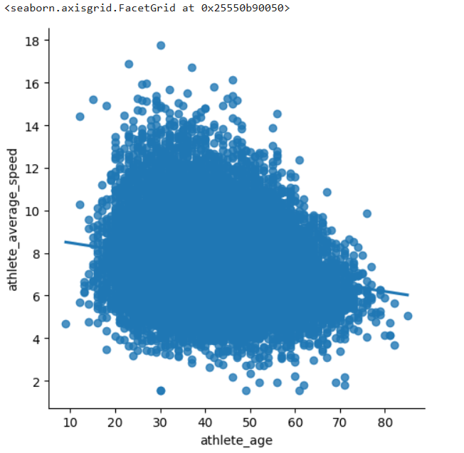
The most competitive age groups for 50Mi races fell between 30–40 years old, with older and much younger runners showing lower average speeds. I limited the rankings to age groups with a minimum number of participants to ensure fairness.Seasonal Patterns:
Races held in summer months saw a slight drop in average speed, supporting the idea that extreme heat may impact endurance performance.
Each of these insights was visualized using tools like:
Histograms and KDE plots
Violin plots split by gender
Regression lines showing age-speed trends
Bar charts ranking age group performance
📦 Tools Used
Python (Jupyter Notebook)
Pandas & NumPy for data wrangling
Seaborn & Matplotlib for visualization
Kaggle for the original dataset
🧠 What I Learned
This project helped me deepen my understanding of:
Working with large, real-world datasets
Cleaning and transforming data for meaningful analysis
Communicating complex ideas visually
Deriving actionable insights from filtered, structured subsets
It also reinforced how much storytelling matters in data — not just what the data says, but how you present it can make all the difference.
👀 Explore the Work
If you're interested in the code and methodology behind this analysis, you can check out the full notebook on my GitHub.