Click the image to view the interactive dashboard
🌍 Project: Visualizing the True Cost of International Education
Tool Used: Tableau
Skills Showcased: Data Cleaning · Feature Engineering · Data Visualization · Dashboard Design · Storytelling
📘 The Story Behind the Data
As a data enthusiast, I’ve always been drawn to problems that blend human decision-making with hard numbers. One of the most critical and expensive choices young people make today is where to study. The dream of studying abroad is common, but the reality of education costs across countries is often misunderstood, scattered across dozens of university websites and masked by currency conversions and hidden living expenses.
This sparked the idea for my project:
🔍 What if I could build a tool that shows students and families the full financial picture visually, interactively, and transparently?
💡 The Challenge
While tuition fees are often published online, they're only part of the story. What about:
Rent and living costs in expensive cities like London or New York?
Visa and insurance fees required by different governments?
Exchange rate differences that quietly raise the real cost?
I set out to build a dashboard that could answer these questions at a glance.
🛠️ My Process
📥 1. Data Preparation & Cleaning
I started with a global dataset of universities, tuition fees, and additional education-related costs. Using Python and Excel, I:
Cleaned corrupted characters (like
éinstead ofé) by re-encoding the file in UTF-8.Verified column types and replaced missing values where needed.
Created calculated fields like:
🎓
Total_Education_Cost_USD= tuition + rent over program duration + visa + insurance🏠
Monthly_Cost_USD= monthly tuition + rent + insurance
This transformed a static CSV file into a structured, analysis-ready dataset.
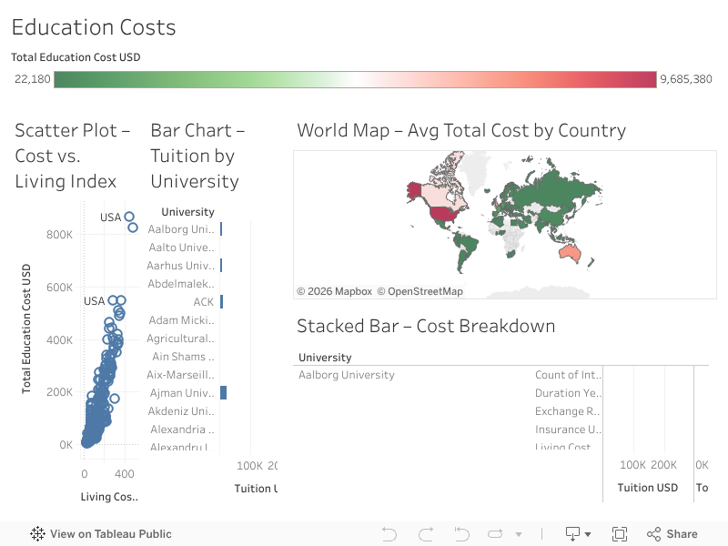
📊 2. Dashboard Design in Tableau
Using Tableau, I brought the data to life through multiple visual layers:
A world map colored by average education cost per country
Bar charts showing the most and least expensive universities
Scatter plots comparing cost of living vs. education cost
Interactive filters for country and program type
Each chart was designed with a question in mind:
Where can you get a world-class education without drowning in debt?
🔍 Key Insights Uncovered
🇩🇪 Germany had almost-zero tuition, but rent in some cities balanced that advantage.
🇺🇸 The US and UK were consistently the most expensive — tuition alone often exceeding $40,000.
🇦🇺 Australia provided a cost-effective option in tech and science fields with balanced living expenses.
These insights empower students and families to plan smarter and spend wiser.
✅ What I Learned
This project taught me more than just Tableau skills—it deepened my ability to:
Clean and transform messy real-world data
Design dashboards that tell a story, not just show numbers
Think from the user’s point of view: What decisions do they need to make? What do they need to see first?
🚀 Explore the Dashboard
💻 Want to explore the dashboard live?
https://public.tableau.com/shared/F95FTG7TQ?:embed=yes&:showVizHome=no
💬 Final Thoughts
This project is a great example of how data visualization can solve real problems—by replacing confusion with clarity. I'm proud of how it blends analytics, design, and storytelling to help others make more informed, financially sound decisions.