Click the image to view the interactive dashboard
📊 Industry Change Dashboard – UK Job Market Dynamics
Tool Used: Tableau
Dataset: EMSI Job Change UK
Focus: Industry-level job change analysis across the UK
🌍 Project Overview
In this project, I developed an interactive Tableau dashboard to visualize and analyze shifts in employment across various industries in the UK. Using the EMSI Job Change dataset, I aimed to uncover key trends in job growth and contraction by industry and geography, providing insights that can support policy makers, job seekers, and businesses in workforce planning.
🔍 Key Insights
1. Leading Industries in Growth
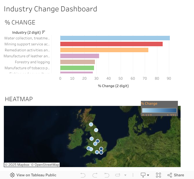
The bar chart at the top of the dashboard presents the percentage change in job numbers by 2-digit industry codes. Some standout findings:
Water collection, treatment, and supply experienced the highest job growth (~85% increase).
Mining support services and remediation activities also saw significant increases (~75% and ~70% respectively).
Other traditionally stable sectors like forestry, pharmaceuticals, and scientific research saw moderate growth, indicating a diverse expansion in both industrial and scientific fields.
2. Geographic Patterns
The heatmap below provides a spatial view of industry change across the UK. Each marker represents a region, and the color intensity reflects the magnitude of percentage change:
Growth hotspots are concentrated in central and southern England, suggesting regional disparities in industrial development.
Some areas in Scotland and Northern England also show notable activity, hinting at emerging economic zones.
🧠 Skills & Techniques Applied
Data Cleaning & Structuring: Processed the EMSI dataset to isolate relevant industry codes and compute percentage changes.
Data Visualization: Designed a clear, dual-section dashboard—combining a bar chart for categorical insights with a geospatial map for regional analysis.
Storytelling with Data: Used color schemes, tooltips, and interactivity to make the dashboard intuitive and insight-rich.
Industry Coding & Interpretation: Interpreted 2-digit SIC (Standard Industrial Classification) codes to present findings in a user-friendly format.
💡 Value Delivered
This dashboard serves as a decision-support tool that stakeholders can use to:
Identify growing industries for job seekers and training providers.
Target investment and development in high-potential regions.
Monitor economic recovery or disruption at both sectoral and regional levels.